Categories
The Current Situation

Bill O’Reilly Loses His Cool [Updated]

Update, May 13, 2008: The original video got yanked, but I’ve posted another copy in its place.

Here’s a great video that’s making the internet rounds: right-wing attack dog Bill O’Reilly, losing his cool and turning into an eight-year-old upon encountering the phrase “play us out”, a term that anyone who’s been in a TV studio at least a couple of times has encountered. Be warned, he bursts into a potty-mouthed temper tantrum and lets fly with the f-word:

This is from his days on the television news tabloid program Inside Edition, which he hosted from 1989 to 1995. I remember thinking that Inside Edition was about as trashy as television got, but that was well before The O’Reilly Factor.

Categories
funny Toronto (a.k.a. Accordion City)

Seen in Kensington Market

Sign: “For rent IMIDIETLY”
Photo by Pete Forde

Categories
The Current Situation

The Dutch Pay HOW MUCH for Gas?!

Dutch blogger George Maschke reminds us that although our gas prices may seem high here in North America (it’s about CDN$1.23 / litre in Accordion City) — high enough that Republican presidential candidate John McCain has suggested a gas tax holiday — they’d be considered a king-sized bargain in the Netherlands. He took this photo of the price sign at his neighbourhood gas station in The Hague on Saturday, May 10th; note that they’re in Euro per litre:

Sign showing gas prices in the Netherlands
Photo by George Maschke.

George did a little math and converted the Dutch prices so that they’d be expressed in U.S. dollars per gallon; I simply did the Euro-to-Canadian dollar conversions to get the prices in terms of Canadian dollars per litre. The results of our calculations appear in the table below:

Gasoline grade Dutch price Dutch price in Canadian dollars per litre Dutch price in American dollars per gallon
Regular €1.559 / litre CDN$2.43 / litre US$9.14 / gallon
Premium €1.673 / litre CDN$2.60 / litre US$9.81 / gallon
Diesel €1.359 / litre CDN$2.11 / litre US$7.96 / gallon

No wonder there’s such a strong bicycle culture in the Netherlands! (Yes, their urban geography helps too.)

Keep these Dutch prices in mind should the predictions of gas hitting CDN$1.50 per litre this summer come true.

Categories
Uncategorized

It’s Not Plagiarism; It’s Just Lameness.

The Director of Communications corrects me, and I apologize: the TTC used their safety poster design (shown below with NYC’s MTA safety poster) with the MTA’s permission.

Comparison of two suspiciously similar saftey posters from the TTC and MTA

The question remains: did they have to mimic it so closely? You might as well put up a sign that says: “Toronto: We’re too dumb to come up with our own identity, so we’ll settle for being the dollar store version of New York City.”

Categories
Work

“The Adventures of Johnny Bunko” — A Manga Career Guide

[This was also posted to Global Nerdy.]

Local tech evangelist David Crow points to The Adventures of Johnny Bunko: The Last Career Guide You’ll Ever Need. Unlike What Color is Your Parachute? or Who Moved My Cheese?, Johnny Bunko is in manga form — that’s right, it’s a Japanese-style comic book.

An unusual book needs an unusual promo, and Johnny Bunko is no exception — it’s got a trailer!

In a review at Amazon, Donald Mitchell provides a quick summary of the book:

Most career writers when they want to simplify a message use a fable, with a few illustrations that show the key perspectives. The fable is clearly secondary to the details.

In The Adventures of Johnny Bunko, the story is more interesting than the advice. Having read a lot of Mr. Pink’s writing, I thought I knew what he would probably advise. But I didn’t realize that he would make the story so interesting, and that the manga format would add so much power to the story telling. Nice work!

What’s the advice? Let me rephrase to make it clearer to you:

  1. Don’t be rigid about planning out each step well in advance . . . it’s not possible to do.
  2. Build on what you’re good at (Peter Drucker originated that one) and avoid relying on what you aren’t good at.
  3. Focus on what you can do for others (start with the boss) rather than what’s in it for you (you can read more about this in How to Be a Star at Work).
  4. Keep at it. Practice makes perfect.
  5. Take on big challenges and learn from them.
  6. Make a difference.

I think I’ll pick up this book — it’s pretty cheap, and I’d like to see how Daniel Pink uses the manga format to advantage.

More Advice from Daniel Pink

Here are some video clips featuring Daniel Pink some pretty interesting giving career advice…

Abundance, Asia and Automation

Pink says that the really useful skills are those that are hard to outsource, hard to automate and that serves a need that goes beyond functional. And those skills are the right-brain ones — the ones often derided as “soft skills”.

Help! My Resume Has Too Many Jobs!

Don’t worry if your resume looks like it has too many jobs on it — the world of work today doesn’t give out prizes for lifetime service. These days, it’s about whether you can solve their problems.

Exercise Creativity at Your Job

The old adage applies: “It’s often better to ask for forgiveness than permission.” And from my own experience, I can tell you that he’s right.

Choosing a Major

Follow your interests — don’t choose a major based on what kind of job you think you’ll get after you graduate. The job market is likely to change! Follow your passion instead. You should also work on your “high concept” and “high touch” skills.

Categories
Toronto (a.k.a. Accordion City)

Design Plagiarism at the TTC (or is it the MTA)? [Updated]

It’s not plagiarism; it’s just lameness. Be sure to read the “Updates” sections at the end for details.

Take a look at these suspiciously similar subway safety posters. The one on the left is from the Toronto Transit Commission, the one on the right is by New York’s Metropolitan Transit Authority:

Comparison of two suspiciously similar saftey posters from the TTC and MTA
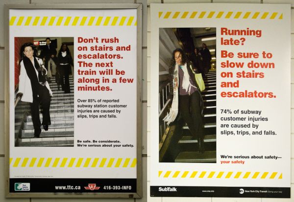
Click the photo to see a larger version.
Photo courtesy of Miss Fipi Lele and Vidiot.

My question is: who plagiarized whom? Given the New York envy that a lot of city planners, developers and assorted people running Accordion City seem to have, coupled with the unoriginality of the ad campaigns to promote the city, I’d bet that the TTC did it. I’d love to be proven wrong, but this has all the hallmarks of our local brand of half-assery written all over it.

Update 1:

“senior”, a commenter, points out that:

If you read the gray text on the bottom left of the Toronto poster, you’ll see that it says something along the lines of “posters produced in co-operation with the MTA.”

While it’s honest, it’s still lame. We both agree that it’s pretty sad that the TTC couldn’t come up with their own safety poster ideas.

Update 2:

A response from Brad Ross, Director of Corporate Communciations for the TTC, with the downright Chuck-Norris-ballsiest first sentence I’ve seen in a comment on this blog in a good long time:

You are wrong.

The Toronto Transit Commission requested, and received, permission from the MTA to use this creative concept. Transit properties across North America often share “creative” when communicating safety messages to their customers.

If you look closely, you’ll see a line that reads, “Concept and design R Metropolitan Transportation Authority, New York.”

Constructive criticism of the TTC is welcome, but alleging plagiarism without first checking the facts is simply unfair.

Regards,

Brad Ross
Director – Corporate Communications
Toronto Transit Commission

Hello, Mr. Ross!

Firstly, please allow me to apologize for calling “Plagiarism!”. I couldn’t read the text at the bottom of the photo and assumed it was graphic design plagiarism, which happens quite often.

I updated my blog to correct that as soon as I find out. That’s the beauty of this medium: its ability to adapt as new information comes in or as dictated by circumstances. It’s an ability I hope the TTC will someday acquire.

I think that there are ways to get the share creative without being so stultifyingly, blandly, boringly, homogenous. The MTA’s poster reflects its unified design identity right down to its typeface. The only thing that’s uniquely “Toronto” about the TTC’s poster is the photo — the rest of the poster, right down to the layout comes off as being a lackluster copy of the original. What’s partly to blame is the lack of a unified graphic identity for the TTC, an organization whose communication skills are so poor that its best website and merchandise are fan-made, not official.

I’m certain that you could’ve gone with the general creative concept for the safety poster and done something a little original.

Categories
Uncategorized

Chop Suey Specs

I should let Angry Asian Man know about this one — a pair of joke glasses in the same racist spirit as “Commander Riker” in this poster:

“Chp Suey Specs” - joke glasses that make your eyes look “Asian”
Photo courtesy of Miss Fipi Lele.

Look closely at the package: it says “Made in Hong Kong”. Yowch.