The Director of Communications corrects me, and I apologize: the TTC used their safety poster design (shown below with NYC’s MTA safety poster) with the MTA’s permission.
The question remains: did they have to mimic it so closely? You might as well put up a sign that says: “Toronto: We’re too dumb to come up with our own identity, so we’ll settle for being the dollar store version of New York City.”
15 replies on “It’s Not Plagiarism; It’s Just Lameness.”
Or, it’s ‘Hey, somebody already spent thousands of dollars developing and testing the design of a safety poster, let’s not waste money that could be better spent on, say, making our escalators work occasionally on re-inventing the wheel.’
@Jacquilynne: An interesting point. Let me mull that one over for a bit.
It would be better to rip out the escalators than pretend they are all going to get fixed sometime soon. At some stations (Don Mills, Yonge/Sheppard, St George) you are pretty well guaranteed that at least one escalator is busted per week.
Let’s say you travel to different cities with subway systems, and you see similar signs in each place telling you to slow down. Kind of like (though obviously on a smaller scale) the way that stop signs, etc. look the same in (some) different places.
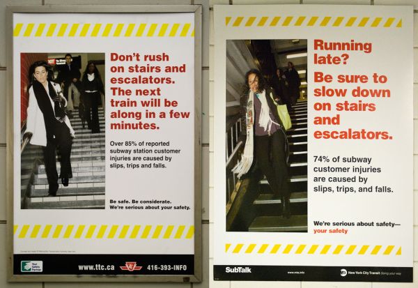
Why is the subway in Toronto 11% more dangerous than the NYC one?
Also, the posters have made me wonder what the causes of the other 15% of subway injuries are. Fingers in doors? Falling off platforms? I need to know!
Joey, reuse of the fruits of an expensive development effort shouldn’t be so foreign to you as a software guy.
I would challenge the assumption implicit in your critique that there’s something inherently wrong with reusing a design in this way.
Can you explain what harm or impropriety there is in even reissuing the same posters wholesale in a completely different geographical market?
Our rushing lady is much more chic than the NYC version… plus we have a higher percentage of stair accidents. I say the TTC’s version is an improvement on the original =)
Toronto *is* the dollar store version of New York City… as Hamilton is the dollar store version of Toronto… ;-}D
Seriously though, the real lameness is in the awful secondary school level design.
I love Helvetica as much as the next font geek, but the person who designed this obviously has no clue about how to use things such as leading and neutral space.
A truly pedestrian effort. (Like my pun?)
There are lot of fair critiques to be made of the TTC, but this isn’t one of them. If the poster has proven to be effective, then public safety trumps the alleged desire-not-to-be-lame. I can think of dozens of ways that the TTC can better spend its creative dollars than trying to reinvent this wheel.
Nice one, Mike. Also, the “chic” Toronto woman looks more like she’s lurching along drunkenly than rushing down the stairs to quickly.
It’s like a badly designed warning for Yorkville trash. 😉
OK so maybe I’m projecting the drunkenness, but the main point stands: she’s just not moving that quickly.
Anyone have examples of compelling transit ads TTC could mimic?
Our running girl is decidedly more stylish than NYC’s.
She looks frumpy.
Im not sure which is worse: this, or the garbage ads (http://spacing.ca/wire/?p=922).
hey, at least it isn’t as bad as that one a while back about all the new busses – the one that had the silhouetted jesus type figure guilding a child and a small ape(?) up a mound of… something as they waited for a flying bus while the text crookedly proclaimed “They Are Coming”… i mean, that was just terrifying.