
Click the graph to see the source of this misleading graph, the Fraser Institute report Ontario: No Longer a Place to Prosper.
In their latest white paper, the conservative/libertarian/pro-Voldemort think tank known as the Fraser Institute is playing dirty statistics pool. Take a look at the graph above (taken from page 15 of the report), which at a casual, innumerate glance, paints a picture of Ontario as a Soviet-style bureaucracy where there are more public sector jobs than private sector ones.
Then take a closer look at the Y-axes for each of the job categories:
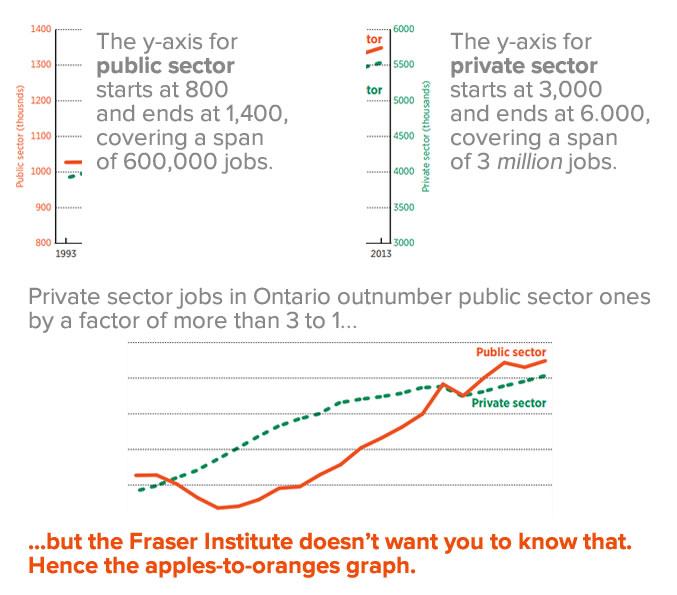
Each line has its own y-axis, with the private sector axis starting at a higher number and on a much larger scale than the private sector axis. This trick allows them to make it appear as if public sector jobs are taking over, a bit of graphing jiggery-pokery that’s about as intellectually honest as the canoe vs. battleship comparison shown below:

The one bit of honesty in the Fraser Institute’s graph is that they provided a citation showing where they got the data from: Statistics Canada’s CANSIM table 282-0089, the Labour Force Survey estimates. I went there, used the “add/remove data” feature to narrow the report down to Ontario for the years 1993 through 2015, plugged the January numbers for each of those years into Excel and generated this graph:
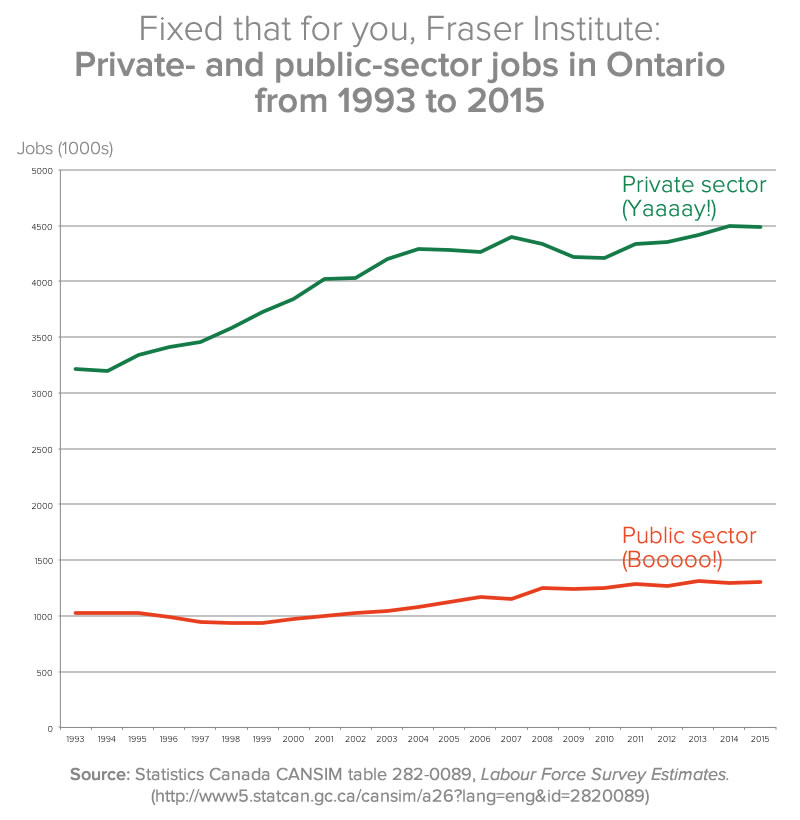
Click the graph to see it at full size.
The funny number games don’t appear to end there, however:
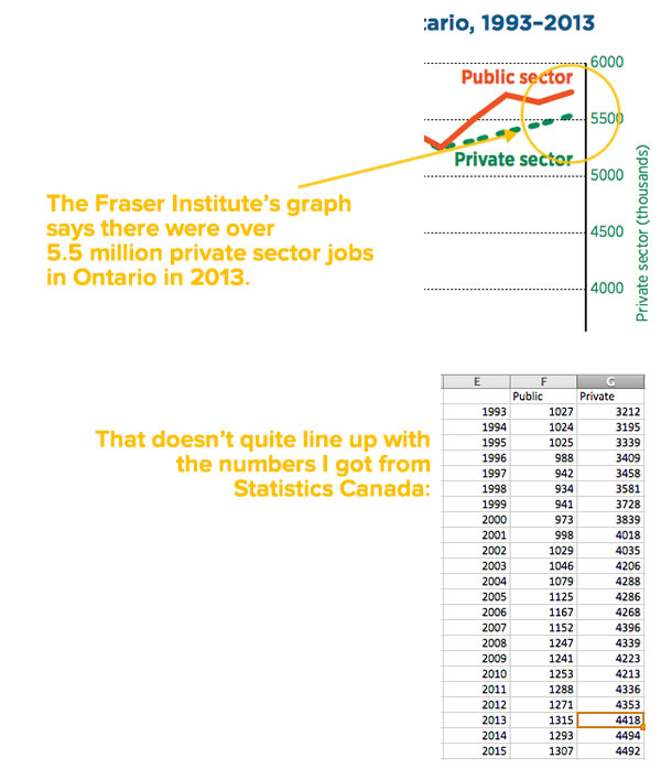
Again, if you want to look at the numbers, go to Statistics Canada’s CANSIM table 282-0089, the Labour Force Survey estimates, use the “Add/remove data” feature to limit the numbers to Ontario, and set the span of time to January 1993 – January 2015. I took those numbers and plugged them into this spreadsheet.
When someone presents you with a graph like the Fraser Institute’s, they’re counting on you to be lazy and ignorant. Don’t let them be right.
3 replies on “Lies, damned lies, and the Fraser Institute’s misleading graph”
Good catch, Joey. Gotta love those Frasers.
Even the public sector side misrepresents the values….the Fraser graph shows well over 1.3 million jobs but the numbers in the table are barely over 1.3M. Not that hard to get Excel to put the line in the right place.
If their numbers are taken to be accurate, which has been suggested that they are not, another interesting feature is that in the 1990s, there was one public service employee for every 3.7 private sector employees. Now, the ratio is much closer to one public service employee for every 4.0 private sector employees. Isn’t Ontario going exactly the direction that this institute would want us to go?