
Don’t you wish all government handbooks were set in Comic Sans
and had the word STUFF in all caps and quotes?
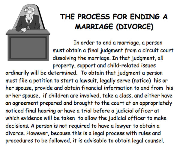
Click the photo to see it at full size.
Believe it or not, this is an official government handbook on the topic of one of the biggest decisions you’ll make in your life, and it’s set in Comic Sans. Comic effing Sans.
It’s also really more of a “What happens if you decide to end your marriage” book, and state law requires both parties getting married to read it before they’re allowed to get a marriage license. Again, I stress that this is a document that you are legally mandated to read, even though its poor choice of fonts and crappy clipart make it look more like a memo about proper use of the communal fridge at your office. Here’s a snippet:
Anitra and I had to read this poorly-designed, somewhat depressing document this morning, as we got our marriage license today, a month out from the big day. As we were paying the fee, two guys walked up to the booth beside us. They’ve been together for 22 years — that’s over four times the length of my previous marriage — and only now do they they have the legal right to get hitched. They raised their eyebrows at having to read this cheesy little book, and I said “It’s not too long. A bit of a bummer, but not long.” Later, when we got our license and made out way to the exit, they congratulated us and we congratulated them back.
If you’d like to read it for yourself, it’s posted online. Enjoy!
2 replies on “Florida of the day: The State of Florida’s depressing marriage handbook”
I still haven’t figured out all this Comic Sans hate. Comic Sans is a pretty serious font. Physicist use it to announce things like the Higg’s boson and Florida uses it to get people thinking seriously about marriage. For some things the typography is far less important than the text. Let the font experts blabber in beautifully kerned Lorem, but for something with real purpose and import, go for Comic Sans. Maybe we’re seeing an uprising against the esthetes who can’t get past the glister to find the gold.
[…] As I wrote in my blog post from February 2015: “Believe it or not, this is an official government handbook on the topic of one of the biggest decisions you’ll make in your life, and it’s set in Comic Sans. Comic effing Sans.” […]