(Attention Ethan Zuckerman! You might might have seen the map below, but just in case, I thought I’d call it to your attention.)
Update: Ethan wrote back — see the end of the post!
Yesterday, I found out about a map produced in 2002 by
Canada’s International Development Research Centre (IDRC).
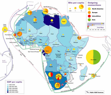
It’s titled The Internet: Out of Africa and shows a relatively new
metric of internet use: bits per capita. A smaller version is shown below; click it to see it at full size.
African bits per capita. Click the map to see it at full size.
The IDRC page introducing the map reads:
The size of the Internet in a country indicates an element of its
progress towards an information-based economy. International Internet
bandwidth provides a measure of Internet activity because many people
share accounts, or use corporate and academic networks along with cyber
cafes and business centers. Outgoing bandwidth also takes better
account of the wide range of possible use, from those who write a few
emails each week, to users who spend many hours a day on the net
browsing, transacting, streaming, and downloading. Because of this, the
often used ‘Number of Internet Users’ indicator may have less relevance
in the developing world than in other places.
There’s
a circle for each country; the size of the circle is proportional to
the outgoing bandwidth for that country. Each circle is a pie chart
showing the proportion of bandwidth destinations. For example, Seychelles
(the teeny island on the eastern end of the map) has way more outgoing
internet traffic than anywhere else in Africa, 50% of which is bound
for North America and the other 50% bound for Asia. Chad, among whose neighbours are the fun bunch of Niger, Libya and Sudan, has the least bits per capita.
Countries are colour-coded by GDP per capita. Clearly, I’m not up on Africa, as I would’ve guessed that Egypt’s (US$4,200 per capita in 2004) would’ve been higher than that of Libya (US$6,700 per capita in 2004) or Gabon
(US$5,900 per capita in 2004). I think the map is wrong when it comes
to South Africa; I’d have bet that even in 2002, its GDP per capita
would be the highest, as it was in 2004: US$11,000 per capita.
For comparison’s sake, Canada’s GDP per capita for 2004 was US$31,500, the United Kingdom’s was US$29,600 and the United States’ was US$41,000, about 10 times that of Egypt.
Update (Tuesday, August 9, 2005 — 2 p.m. EDT):
Ethan writes:
Thanks, Joey. It’s a very famous map, and
has been in almost everyone’s slide deck for ICT4D presentations for
the past couple of years. It’s wildly out of date, though, and more
than a little bit deceptive. It’s got a very strong bias for
fiber-based internet access and against satellite, which may be a
technically sound bias, but doesn’t reflect commercial reality on the
ground… It also doesn’t visualize Internet Exchange Points, either
countrywide or regional, which are a critical part of the Africa
connectivity picture. Still, it’s a very useful image for folks trying
to explain some of the challenges of connectivity on the continent. And
it’s interesting to see that a good map still gets circulated almost
four years after its creation…
Thanks for the info, Ethan!
