Here’s a fun little exercise — can you identify the cartoon characters by their silhouettes in the illustration below?

Click the image to see it at full size.
Image courtesy of Miss Fipi Lele.
Here’s a fun little exercise — can you identify the cartoon characters by their silhouettes in the illustration below?
Click the image to see it at full size.
Image courtesy of Miss Fipi Lele.
If you showed the ad below for Arrow menswear to an advertising exec today, s/he’d probably say: “Too wordy! You can’t see the real product! The illustrations are too small!” It’s a shame, because I rather like the style of these old ads:

Click the ad to see it at full size.
Image courtesy of Miss Fipi Lele.
I should show this to Tris at Manscaping 101.

Photo courtesy of Miss Fipi Lele.
Rotten Tomatoes, which takes all sorts of reviews for movies and computes an overall score, gave The Other Boleyn Girl a 40% rating.
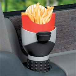
“Even has a clip-on ketchup cup!”
The French Fry Holder pictured above is in Improvements’ catalog. It’s currently not in stock, but I’m sure with enough demand, they’ll restock this life-changing apparatus!
Here’s the description from the catalog:
French Fry Holder
Hold Your Fries In Your Car’s Cup Holder And Make Driving Safer.
Cars now come with several cup holders, and this innovative accessory helps you make the most of them! French-Fry Holder holds one order of fries (and its cardboard container) close at hand! Even has a clip-on ketchup cup! Can also hold snacks or crayons. Fits into virtually any-size cup holder, with a no-slip rubberized base grip to help it stay in place. Also fits in a child’s car seat’s cup holder. Dishwasher-safe.
The blog HealthBolt (one of the blogs in the b5media network) has an article about Help Remedies’ cool packaging for things like aspirin and band-aids. The aspirin package is labelled “Help / I have a headache” and the package for the band-aids says “Help / I’ve cut myself”:

Click the photo to go to Help Remedies’ site.
Here’s a closer look at the aspirin packaging, complete with reassuring message:

Click the photo to go to Help Remedies’ site.
On the outside of the aspirin packaging, it says:
As you can see, these pills have 500mh of acetominophen in them. They don’t contain Red Dye #40. If you enjoy Red Dye #40, you will have to eat it separately.
Opening the package not only gives you access to the pills, it also reveals this message:
Hello. I’m sorry about the headache. Don’t be embarassed.
It doesn’t mean you’re dim-witted. Maybe it means the opposite. Maybe your thoughts are so radical they have astounded your brain. You ought to be proud of your headache.
“I have a headache,” you should say to your boss. “You’re promoted,” your boss will say.
But you probably want to get rid of your headache. That’s probably why you purchased this package in the first place. So sit down on a cushiony object, and swallow two tablets.
Click the photo to go to Help Remedies’ site.
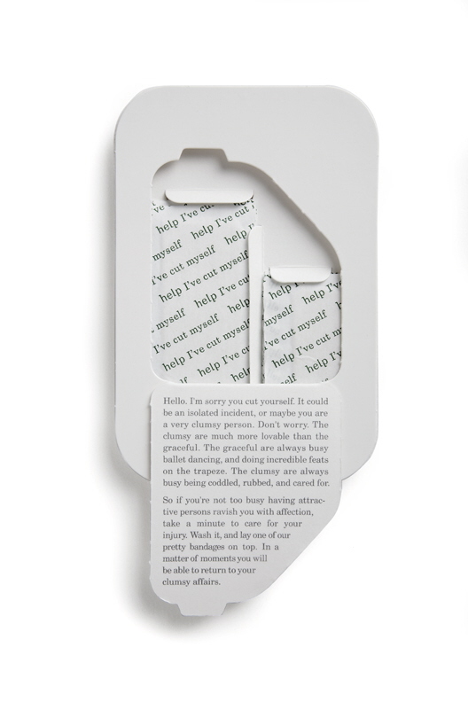
Opening the band-aids package reveals this message:
Hello. I’m sorry you cut yourself. It could be an isolated incident, or maybe you are a very clumsy person. Don’t worry. The clumsy are much more lovable than the graceful. The graceful are always busy ballet dancing, and doing incredible feats on the trapeze. The clumsy are always busy being coddled, rubbed, and cared for.
So if you’re not too busy having attractive persons ravish you with attention, take a minute to care for your injury. Wash it, and lay one of our pretty bandages on top. In a matter of moments you will be able to return to your clumsy affairs.
In addition to these clever messages, Help Remedies come with two added bonuses:
The smart-alecky UK-based technology site The Register noticed something about the new logo for the UK Office of Government Commerce (OGC), picture below:

If you rotate it 90 degrees clockwise, it looks like a stick figure engaging in the act of…er, pleasuring himself:

Come to think of it, considering how government initiatives related to business typically end up, the logo might be appropriate.
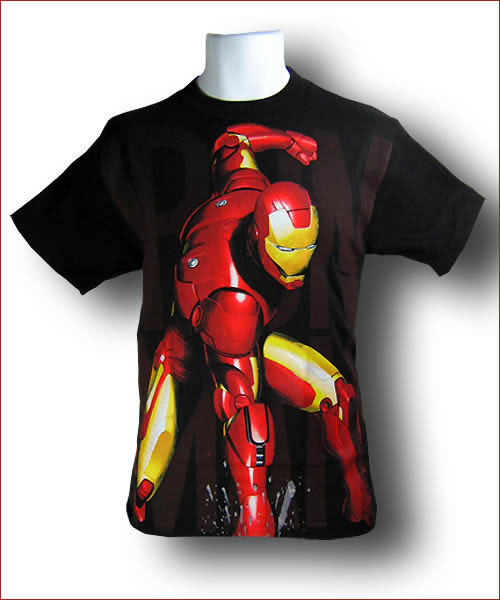
While the unintentional onanism — the term is derived from the biblical character Onan — in the OGC logo is subtle, it’s screamingly obvious in the Iron Man “Knuckle Buster” (really, that’s the brand name it’s being sold under) t-shirt pictured below. Maybe it’s screamingly obvious to everyone except the t-shirt designer. Imagine what this shirt looks like when it’s being worn, and you’ll see what I mean.
…hence the graphic below:

You can also call it “Arial Serif” if you like, because Arial and Helvetica are the same thing.