Here’s a graph that Reuters recently published on gun deaths in Florida before and after the enactment of the “Stand Your Ground” law. Take a really good look at it and see if you can figure out why it’s so terribly misleading:
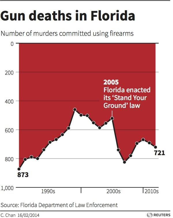
Click the graph to see the source.
P.A. Fedewa saw the graph in Business Insider and submitted this graph in response. The data is the same, but this time, the presentation isn’t attempting to lie to you:
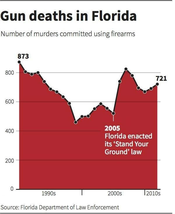
Click the graph to see the source.
Update
More worrisome than the murder rate should be the rate of people getting away with shooting someone in a situation that isn’t reasonably self-defense (they wouldn’t be reflected on this chart). And the problem there isn’t the stand your ground principle (which is common, even California has that principle), but the lowering of the evidentiary burden and the haphazard way the law is applied.
4 replies on “Lies, damned lies, and Reuters’ graph of Florida firearm deaths before and after “Stand Your Ground””
Conflating gun deaths with gun murders is also misleading. More worrisome than the murder rate should be the rate of people getting away with shooting someone in a situation that isn’t reasonably self-defense (they wouldn’t be reflected on this chart). And the problem there isn’t the stand your ground principle (which is common, even California has that principle), but the lowering of the evidentiary burden and the haphazard way the law is applied.
Mark Jaquith: Thanks for the comment! I’ve added your observation to the body of the post.
It’s misleading because it looks like a cat licking itself, right?
That, and wtf Reuters, where’s the “Sponsored” icon for whomever paid them to flip the chart upside down?
Thanks for this discussion! I used this example recently in a Data Literacy class 🙂 callingbullshit.org also, in lecture 6.
What I kept wondering about though: Is it known whether Reuters drew the graph based on FDLE data, or whether the latter actually supplied the graph print-ready? I’m not sure which variant would be more worrisome.