Back in May, I pointed to some Belarusian posters for American movies. They were clumsy hand-painted approximations of the American versions. As a refresher, here’s a Belarusian poster for Scooby-Doo:

The retroCRUSH shows a set of Polish posters for American movies, all of which take a completely different approach. Instead of slavishly copying the American promo material, the artists behind these posters ignored it entirely and created high-concept versions that aren’t just better artistically, they also make the movies seem better than they actually are.
Take Superman III (please). In case you don’t remember — and if you don’t, there’s a recap at a site called The Agony Booth — it’s the one with Richard Pryor. It would’ve been the worst of the bunch, but it was saved from this fate by the even more painful Superman IV: The Quest for Peace.
Here are the American and Polish posters for the movie:


Left: Original poster for Superman III. Right: Polish poster for the same movie.
There’s a simple rule when creating posters for Hollywood movies: be as literal as possible. For example, Short Circuit 2 features the sentient pacifist military robot known as “Number 5” in fish-out-of-water antics in the big city with his human friends, and the American poster lets you know this before you’ve even a single frame of the movie. The creators of the Polish poster weren’t afraid to go a little more abstract:

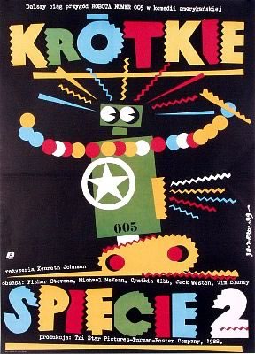
Left: Original poster for Short Circuit 2. Right: Polish poster for the same movie.
The American poster for Alien is quite good and far more abstract that most of the American movie posters of the time, but the Polish one does a better job of capturing the movie’s sticky-icky H.R. Giger feel:
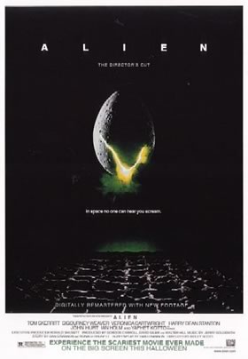

Left: Original poster for Alien. Right: Polish poster for the same movie.
In spite of the fact that the plot of Weekend at Bernie’s is pretty much an excuse to come up with about 90 minutes’ worth of corpse desecration gags (the waterskiing scene is my favourite, especially when Bernie starts hitting the channel marker bouys), it’s a light-hearted comedy. You wouldn’t be able to tell that from the Polish poster:
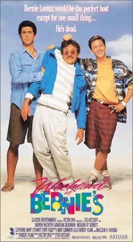

Left: Original poster for Weekend at Bernie’s. Right: Polish poster for the same movie.
And finally, we get into deep abstract territory with Trading Places, which the Polish artists go hog wild and make it seem to be an art film that is both a searing indictment of the American capitalist system and three lectures’ worth of stuff for a semiotics course:
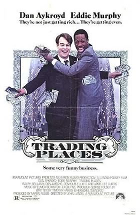
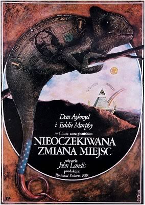
Left: Original poster for Trading Places. Right: Polish poster for the same movie.
If you’d like to see more Polish posters for American movies, check out this page, which features a decent collection.