If you’ve ever wondered which states have the best access to the International House of Pancakes (and they truly are international — they’ve got ’em in Japan, too!), wonder no more. The blog Very Small Array has the answer, and in a lovely visual form to boot:
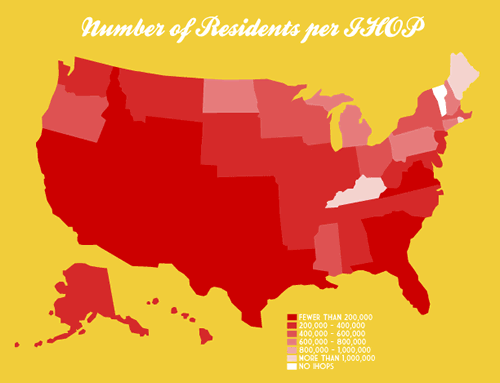
Click the map to see it at full size on its original page.
For those of you who live in the South (dudes at the Starkville Tucows office, I’m lookin’ at you!), there’s another chart showing which states have the best access to Waffle House.