According to this description in Toronto Life magazine (who are a reliable source of information for this sort of thing), the folks at Invitation House do excellent work, and they do it the old-fashioned way, eschewing computers for good old-fashioned letterpress.
Unfortunately, Invitation House is sending the wrong message with their sign, in which the letters are packed like typographic sardines:
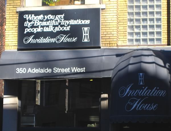
Photo courtesy of RoninKengo.
Here’s a closer look:

Photo courtesy of RoninKengo.
Interestingly enough, Invitation House was a business spun off from a company called Kern Stationers. Kern is exactly what happened to their sign — overly so (the tracking is also a bit tight, in my opinion).
These guys should probably get a new sign made — they probably don’t want potential customers to get the impression that their wedding invitations willenduplookinglikethis.
One reply on “A Sign That Reflects Poorly on Their Work”
They could get a lot more mileage from the sign by replacing “Where you get” with “For”, which even makes more sense grammatically.