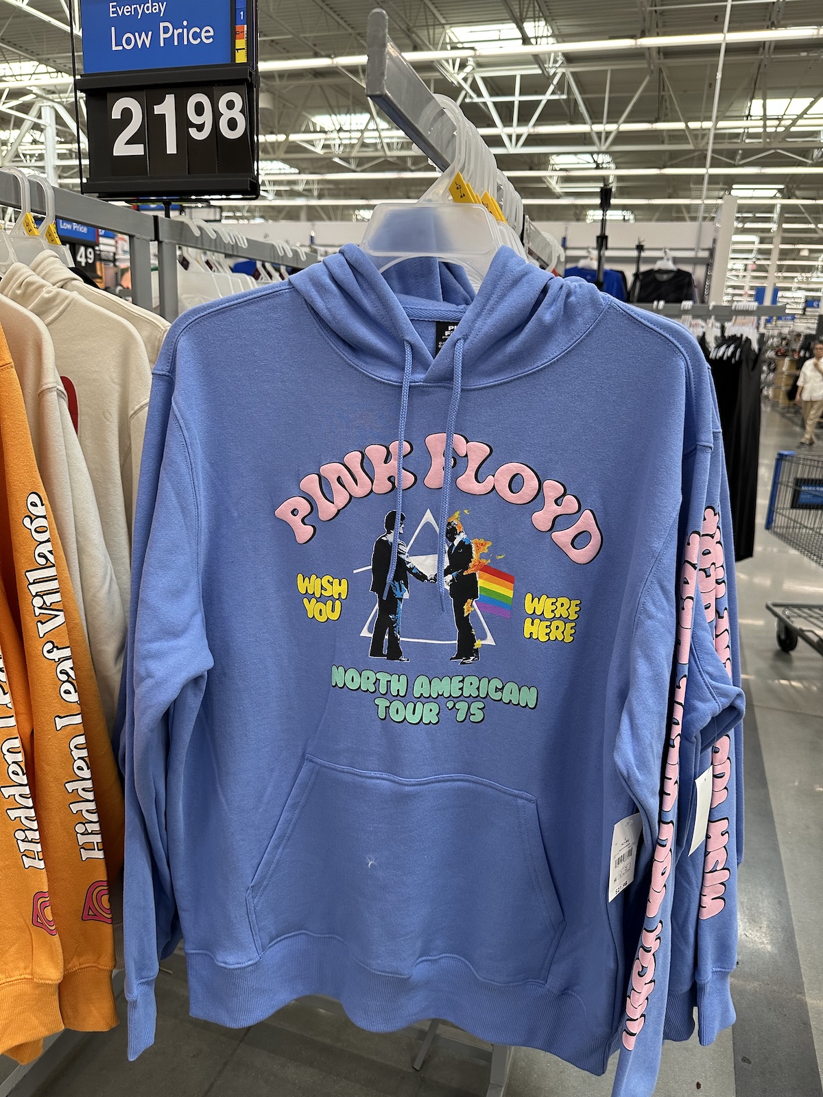
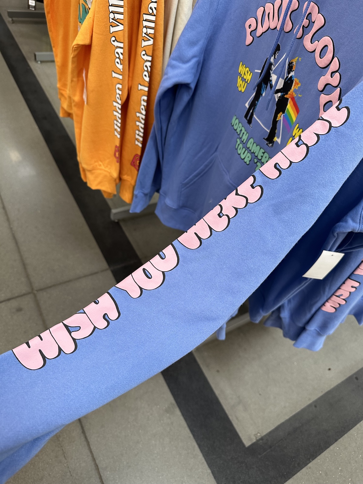
When I first saw this hoodie, my first thought was that its design was a little too bright and bubbly.
An almost periwinkle background? Pink, yellow, and light green lettering in a font better suited to selling cotton candy? Did whoever designed it even listen to the album? Even just once?
Maybe I spent too much time picking out rock t-shirts in head shops on Toronto’s Yonge Street during my misspent youth, but it’s my opinion that prog-rock t-shirts should be black. I think that Wish You Were Here, with its themes of loss and disillusionment with the music industry, is better paired with graphics like those from the video for Welcome to the Machine.
And then it occurred to me: if you were 17 years old in 1975 (when the North American tour featured on the hoodie took place), you’d be 65 years old today. Those bright colors might work better with a retirement wardrobe of golf clothes, cruisewear, and senior chic in general.
First, a little background... There’s a guy who lives a short bike ride from our…
It’s Sunday, and it’s time for another “picdump!” Here are the memes, pictures, and cartoons…
It’s Sunday, and it’s time for another “picdump!” Here are the memes, pictures, and cartoons…
It’s Sunday, and it’s time for another “picdump!” Here are 500+ memes, pictures, and cartoons…
Need context? The Star Trek: Deep Space Nine reference The news
“Bakery”, “road trip”, and “tradition” are often associated with certain geographies in literature and tourism…