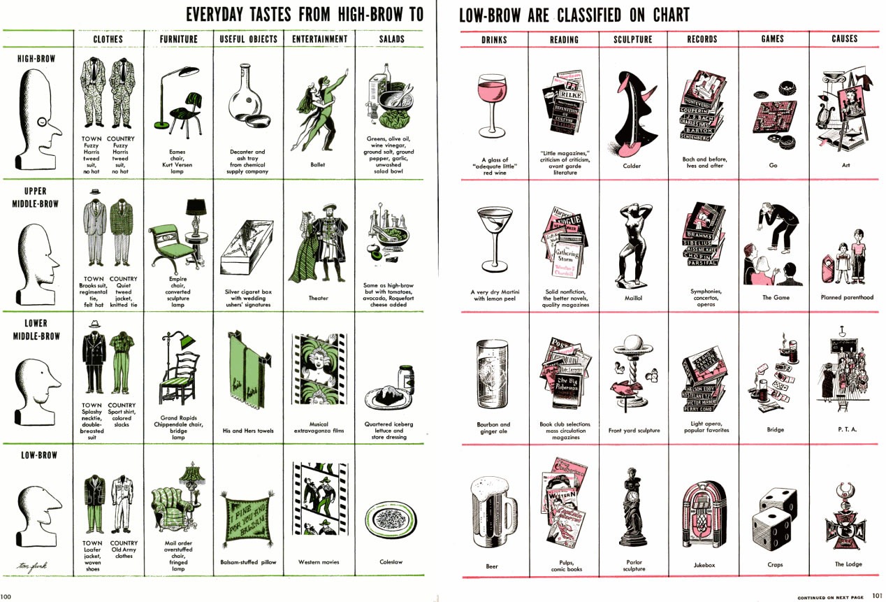
I don’t know when this chart classifying the spectrum of tastes from high-brow to low-brow was created, but the graphic style puts it sometime in the “Mad Men” era of the late 1950s and early 1960s. You can click the chart to see it at full size:
I took a couple of columns from the chart and turned them into an enlarged version, shown below. The columns show “high-brow”, “upper middle-brow”, “lower middle-brow” and “low-brow” tastes in clothes, entertainment and drinks.
Some thoughts on these columns from the chart:
Someone needs to recompile this chart for the present day.
First, a little background... There’s a guy who lives a short bike ride from our…
It’s Sunday, and it’s time for another “picdump!” Here are the memes, pictures, and cartoons…
It’s Sunday, and it’s time for another “picdump!” Here are the memes, pictures, and cartoons…
It’s Sunday, and it’s time for another “picdump!” Here are 500+ memes, pictures, and cartoons…
Need context? The Star Trek: Deep Space Nine reference The news
“Bakery”, “road trip”, and “tradition” are often associated with certain geographies in literature and tourism…
View Comments
Hahahaha! I love shit like this. I guess my beer-drinking puts me in the low-brow section.
Looks like Ad Reinhardt's style -- very cool.
Whoops, the signature indicates it's Tom Funk -- should have looked more carefully.
Anyone know what 'The Game' is?
Option 1: it's apparently some game they played that involved a man making an odd gesture. Charades maybe?
Option 2: Joey made this whole thing as a very elaborate delivery device to make us read the phrase "The Game" therefore causing us to lose it.
It was created by Russell Lynes for Life magazine in 1949 based on an article he had written for Harper's a few months earlier. He was a noted art historian and wrote several books on American taste in art.
At this link you can read a 1983 interview with Lynes in which he cleverly updates the chart to 1980s standards of taste.
http://www.americanheritage.com/articles/magazine/ah/1983/4/1983_4_42.shtml