Here’s a pie chart showing the content of half an hour’s worth of CNN Headline News. No wonder the results from that Indiana University study said that The Daily Show was as substantive as “real” news shows…
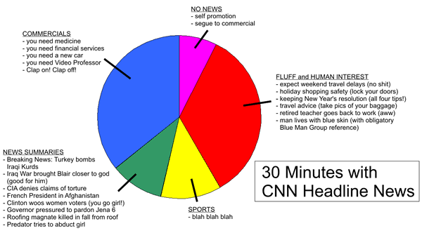
Click the graph to see it on full size on its original page.
2 replies on “30 Minutes with CNN Headline News”
Thank you for making me feel a whole lot better about getting rid of cable/satellite TV. (Well, I guess I am missing The Daily Show, too, in addition to the hard-hitting journalism of Headline News).
[…] 30 Minutes with CNN Headline News […]